So I've revamped the site so it will be more accessible and more professional, and added a resume. The change was long overdue. I'm still having trouble with fonts, however, so if you see Comic Sans or something equally nasty, I assure you it's meant to actually be a quite nice font, but the site keeps spitting it out differently.
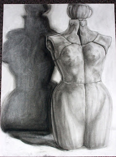
Also, here's some of my art from my drawing class last semester! Hopefully I'll have more illustrative and conceptual art up soon. (Also, sorry for the low quality of these photos--I'll try to get better soon.)


No comments:
Post a Comment